Launch Watch · Evidence study
Published
Caldor Fire maps: three layers, three different training labels
A worked reading of two Caldor Fire frames separates active detections, front history and burned area before they become machine-learning labels.
A broad gray footprint fills the middle of NASA’s August 21, 2021 Caldor Fire visualization. Bright red detections collect around some edges and also appear inside it. Which part should become a “fire” label in a machine-learning dataset?
That question has three different answers because the graphic contains three different targets. The distinction matters before any model is trained: the gray footprint describes accumulated burned area, red points locate detections, and yellow outlines retain recent front history. Collapsing them into one class would change the problem being learned.
This worked reading uses two real NASA frames and their published legend. Its contribution is a reusable label-audit table, checked against the August 21 and August 28 views. It is a product-semantics analysis, not a new fire-area measurement.
Read the legend as a data contract
NASA’s Scientific Visualization Studio account describes an update every 12 hours using active-fire detections from Suomi-NPP’s VIIRS instrument. Yellow lines preserve 60 hours of tracked-front positions, with the newest outline shown brightest. The gray layer is the tracking system’s estimated accumulated burned area.
Those time windows belong with the labels. An image can show all three at once without making them simultaneous measurements of the same thing. A cumulative estimate carries history; a recent detection represents activity found in its input observations; an older front remains visible because the display intentionally preserves it.
| Layer | Appearance | Time support | Meaning | Label error to avoid |
|---|---|---|---|---|
| Active-fire detections | Red points | Detections feeding the 12-hour update | Locations of detected activity | Treating empty space between points as a verified non-fire class |
| Tracked front history | Yellow outlines; latest brightest | Previous 60 hours | Derived front positions through time | Training against all outlines as if they were simultaneous |
| Estimated accumulated burned area | Gray region | Cumulative through the frame | Estimated footprint accumulated by the tracker | Labelling the whole footprint as active flame |
The table separates what a layer means from what a model might be asked to predict. A segmentation target based on the gray footprint would reward recovering that footprint. A detection target would reward locating detected activity. Calling both tasks “fire mapping” does not make their labels interchangeable.
August 21: the interior is the useful clue
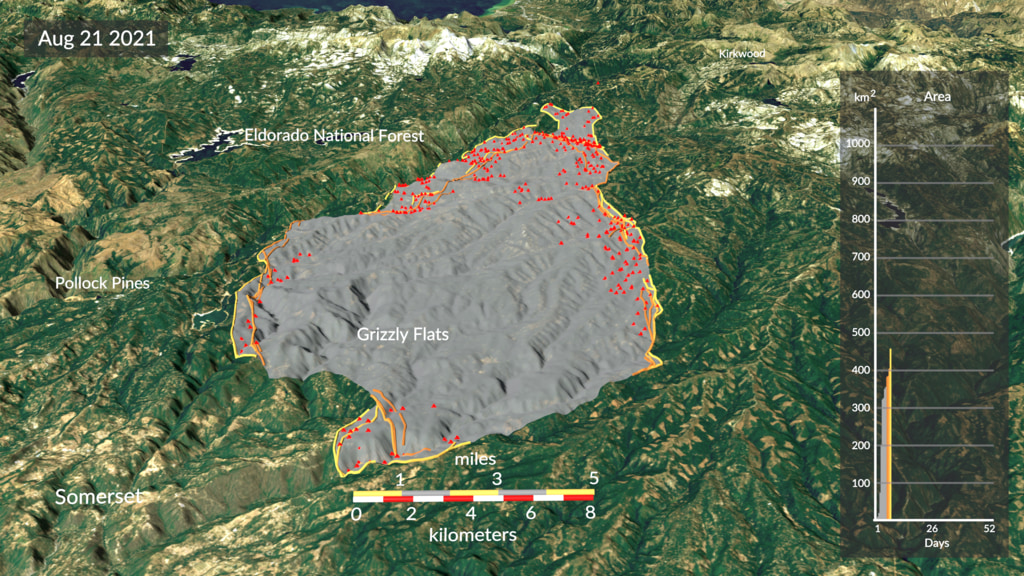
Look around the Grizzly Flats label in the center of the August 21 frame. The gray area is broad and continuous, while red marks are scattered. Many red detections sit near the outer fringe, but some sit within the gray region. The picture itself therefore does not support a rule that “inside the perimeter” and “currently detected fire” are mutually exclusive categories.
For an annotator, this is a practical warning. Drawing one polygon around the gray region and naming it “active flame” would add a wall-to-wall claim the displayed detections do not provide. Drawing only the red marks and calling the result “all burned land” would throw away the accumulated footprint. Neither choice is a harmless simplification of the other.
The yellow lines add a second trap. Several nearby outlines can describe changes through the retained history. Treating all of them as the present front would put different times into one supposedly instantaneous target.
August 28: more footprint, still several questions
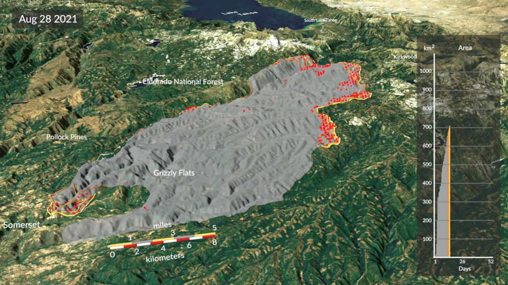
The later view shows an elongated gray region extending near Somerset and toward the upper-right terrain. Red detections remain grouped at several fringes, with some interior marks. This is another visible example of a footprint and an activity layer occupying related but different spatial patterns.
The two images also resist an easy shortcut: subtracting the JPEGs. Their camera framing differs, and the scale bars occupy different positions and orientations. A shift on the screen cannot be treated as a measured displacement on the ground. These provider-rendered views are useful for reading layer relationships; pixel differencing would require registration and geospatial data that the pictures alone do not supply.
No area, point count, spread speed or classification score has been extracted here. That restraint preserves the useful result: the semantic distinction is visible without pretending the presentation image is an analysis-ready raster.
Test a label before it becomes training data
A compact label definition can make an annotation review much more productive. Write down the target, its time support and its reference product before drawing a boundary. In this example, “estimated cumulative footprint through August 28” and “active detections feeding the current update” would lead to different datasets even when both use the same fire.
Check the statement: “Every gray location is actively burning in this frame.”
The statement goes beyond the gray layer’s definition. Gray represents estimated accumulated burned area. Some red detections occur inside it, but the footprint does not assert activity at every location. Use a separate activity target if that is the question.
Check the statement: “The yellow lines are one current boundary.”
The legend retains front positions over 60 hours. The brightest outline marks the latest location in this display. Combining every outline into one present-time boundary would remove the history encoded by the visualization.
The important review question is whether an output would be wrong under the chosen definition, rather than whether it looks plausible on a fire map. If the target is accumulated footprint, missing a gray interior region matters. If the target is detected activity, filling every gray interior region creates unsupported positives. That difference should be settled before choosing a loss function or reporting a score.
What this comparison supports
The audit uses the provider’s published legend and two unchanged visualization frames. It does not reproduce the tracking algorithm, resolve raw 2021 tracking-file availability, or evaluate detection completeness. The rendered terrain and chart remain contextual layers, not newly measured evidence in this analysis.
For anyone building a fire-imagery dataset, the next useful step is small: put the target’s noun and time window in its name. “Cumulative burned area,” “active detections” and “recent front history” are three usable labels. Keeping those meanings intact makes a later model result much easier to trust.
Sources and image use
- NASA SVS: Spread of the Caldor Fire, 2021, including the two dated frames, legend and data credits. The visualization was released June 1, 2022; the event frames are from 2021.
- NASA images and media guidelines. Images are reproduced unchanged for factual editorial discussion with provider credit. No agency endorsement is implied.